Blog Post 6 – Post-mortem

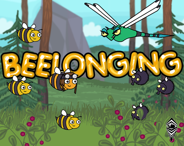
“Be(e)longing; playing should feel like be(e)ing part of something bigger” – aesthetic goal

630times500 coverv2

If there is one word I’d pick to describe these last ten weeks it would have to be intense. It comes as no surprise that making games is just that, but it is another thing entirely to actually experience it. Even if Beelonging wasn’t our own concept from the start, I think I can say I’m speaking for my whole team when I say that we all became attached to it fairly quickly. If it was because of the wholesome aesthetic goal, the cute bees, or something else entirely is hard to say, but regardless it has definitely been a joy to work on. When you’re working on something you’re passionate about, you really go the extra mile to make it as good as possible, even if it means putting in a lot of extra effort and time.

The end product is something we’re all proud of, and its almost difficult to grasp that we actually made it. That being said, there is of course things that could’ve been improved. Therefore, I’m going to break down the final result into a list of particularly good things and some things that could’ve been better.

What was good

  • First and foremost I must say that one of the things I’m the most proud of when it comes to the end result is that we managed to make several different levels, and a boss fight (and a tutorial). It makes it feel like a complete game, which has a definitive beginning and end.
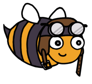
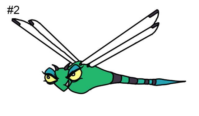
  • Being two graphics with two different art styles, I’m happy that we managed to create an art-style which worked for both of us, without making the assets we made look too different. In general I’m also just pleased with the game’s visuals, how the characters and the background assets turned out etc.
  • The sound effects we recorded and edited also turned out great, and fits the design of the characters. The sound effects really add a lot to the game, and makes it more enjoyable to play.

What could’ve been better

  • As someone who is somewhat of an perfectionist (when it comes to my own artwork at least) I feel like the background could’ve used more polish, or honestly a complete rework. As it was now it was kind of rushed together towards the end of the project, with all team members working on putting out the pre-produced background assets throughout the levels. While I think it turned out good, I would’ve personally liked to have more of a planned approach to the background visuals. Ideally I would’ve liked to have a background that fits the narrative of the game; where it goes from a brighter less dense forest/meadow in the first levels and progressively gets darker as you go deeper into the forest and closer to the bear. This could’ve also added more interest to the levels, as we got feedback that some of them were a bit too repetitive.
  • More polish, in general. Fixing some minor things here and there, improving the intro animation, fixing some off brushstrokes on the win-screen.
  • Finding a song that is less repetitive, or just add more songs, some play-testers pointed out that after five levels of hearing the same track over and over again they started to get a bit tired of it.
Collectionv2
All the bugs I designed for the game! + Beelonging logo by Natali Arvidsson and the Mimic Logo designed by me


So,  what to take from all of this into future games?

I think that one of the mistakes we made (and this mostly has to do with the background) was to not plan enough. While we did put everything that was supposed to be created for the game in the product backlog, we didn’t go trough everything thoroughly. I also think it could be good to set goals of when things should be finished (or at least at their first iteration) from the start, so you don’t just pick random things from the backlog every sprint. I do think we were more structured than that, but its still something worth keeping in mind for the next game.

Everything we make and implement should be reviewed based on the MDA framework. While I think all of us had our aesthetic goal in mind while working on the game, I feel like it could’ve been discussed more.

On a more practical level I’d like to make future line art more smooth. There should also be a agreed upon resolution for assets, how big sprite sheets should be etc. Having an established color scheme is also to be preferred, while I think the colors worked well in Beelonging they could’ve been more coherent.

Lastly, to end this way too long post, if you’d like to play the game yourself you can do so here! It is playable in the browser, but if you’d like to see the cut scenes you’ll have to download it 🙂


I think that is all worthwhile I had to say, thank you for reading! 🐝


Blog Post 5 – Playtesting

Playtesting has for our group been an experience that comes with a mixed bag of emotions. On one hand, its been a great experience to see people enjoying themselves while playing our game, and of course it feels great to receive positive feedback. On the other hand, we’ve during both of the playtesting sessions encountered bugs (not the buzzing kind) that we previously had never seen before. Luckily they haven’t rendered the game completely unplayable, but it still annoyed all of us a great deal since we wanted to show the game we’ve worked so hard on from its best side.

The critique we have received from the playtesters has been extremely helpful, as it has pointed out things about our game from a different perspective than our own. Its easy to become blind when you’ve worked on something for so long, so having a pair of fresh eyes taking a look at your game can really help you spot things that can be reworked for the better. The feedback we have received has definitely helped us make what we already have better, and also spawned ideas to make the game more interesting than what it originally was.

To move away from the general experience of playtesting, I thought I’d discuss how the background of our game has changed thanks to feedback from our playtesters. As an artist, I’m obviously extra interested in feedback concerning the visual aspects of the game. The majority of that feedback has been very positive, which of course makes me very happy. It has also spurred me to work harder. One thing we did get negative feedback about during the beta playtesting was the background. People thought it was hard to discern which obstacles were supposed to be avoided, and they also pointed out that the scale was off with some of the assets and that you could tell some of the assets had been enlarged to the point of appearing pixelated.

To deal with these issues, I decided to make a mock up game screen to give the team something to, at least discuss around, so we knew which direction to take the background in. We were initially unsure about the scale of the background, in other words how close the focal layer (where the action takes place, in our case where the bees and the other bugs are) would be to the background. In the beta playtesting we had the bees be very close to the background, meaning you couldn’t see much of the trees for example. In the mock up I created I instead let there be quite a distance between the focal layer and the background, meaning you could see more of the forest. My primary reason for this was because I just thought it looks more visually appealing, but it also solves the issue with pixelation. Furthermore, it makes it easy to tell what assets are obstacles since they’re very large in comparison.

MockUpBackground

This was the first iteration of the mock up background. After discussing with the team, we realized that the background appeared kind of cluttered like this, and could distract the player from the focal layer. To fix that, I suggested that we’d turn down the saturation of the assets in the background. We also decided to add a blur effect, this was also something that was suggested by the playtesters.

MockUpBackgroundBlurry2

And the finished result! While its just a mock up, it makes it easier for the team to know what to work on with the background, and makes it easier for team members other than artists to assemble backgrounds.

Thanks for reading and apologies for the long post! 🐝

Blog Post Comments 4 – 6

Comment 6

Link to the post: https://nicklasrosen.wordpress.com/2018/03/20/blog-post-6-the-end-result/


Hi Nicklas!

It was insightful to read your post. You bring up both positive and negative experiences from the course of the production, which gives me insight into the process overall. From reading I can tell that you can take the things you’ve learnt during these last ten weeks and apply them to the next course.

Our group also struggled with bugs caused by lack of internal playtesting, so it was interesting to read that your group also had issues with it.

Having the group playing DnD sounds like a great idea, and is something I might suggest to my new group. Sorry to hear it didn’t help with the lack of motivation, but I think motivation is one of those things that is really hard to pick up again once you’ve lost it. Despite that, I think your group had a great game at the end.

Great post overall, if there’s anything I would’ve added it would be a picture, perhaps a screenshot from the game?

Good luck in the next course! – Moa Bruus


Comment 5

Link to the post: https://artdevsam.wordpress.com/2018/03/08/playtesting-and-how-sirens-rose-from-exhaustion/


Hello Samantha!

First of all I must say that this is a well written post, you clearly describe the process your team went through with the playtesting. I think it’s super interesting that you chose to have two computers with different versions of the game, and that your group focused on getting feedback specifically about the innate abilities/pick ups. Like you say in the post it’s a crucial part of playtesting, but still something I think people tend to forget about. Our group had a more aimless playtesting, perhaps if we had prepared more we could have received more relevant data to our then current issues.

I also really like the online playtesting, I have not encountered that in another group and it was really nice to be able to actually play the game that is being discussed in the post! Furthermore, it’s a great way of getting more feedback, and be able to spread it easily to large groups of people.  I also have to say that having a website for the group/game is a great idea and it looks very professional!

Some last short notes, the text explained the game mechanics well so that it could be understood without having to play the game. I also appreciated the disposition of the post, adding the headlines and bolded words made it easy to read.

Great job, and good luck! – Moa Bruus


Comment 4

Link to the post: https://gamedesign905092715.wordpress.com/2018/03/02/more-sounds/


Hello Sofie!


All in all, I think this is a well written blog post, and as I’m lead sound myself in my group it’s interesting to read about your process!


You describe well what you’re analyzing in the post (the production of sounds), how you went about producing them, and why. The motivations behind your choices are clearly communicated, and I like how you go into detail about how you edited the different sounds in Audacity. While I’ve used the program myself I’m sure it makes sense to others who aren’t familiar with it!


I also like your analysis of how to make the sounds fit into the game.

Something I’d consider, especially when it comes to posts about sounds, is that it would be nice to add some way of being able to listen to them! I totally understand if that’s too much work though, as it doesn’t seem you can upload audio directly to a post (without paying)


Great job on this post and good luck! – Moa Bruus

Blog Post 4 – Pine Trees

Time to talk about something else than bugs! and scrum

Since Beelonging is set in a forest we of course had to have some trees, since it would look pretty empty otherwise. Me and Natali (the other artist in our group) planned some background assets that we then split between us. I decided to make pine trees, since I think they’re beautiful and because we decided to have a North European taiga forest in our game. We thought that featuring such a forest would be interesting since its rarely done, at least not in children’s games or cartoons.

treesandbees
Trees and Bees! The four finished pine trees sprites. (FYI, the bees are not part of the sprites.)

I started out by drawing the trees with pencil in my sketchbook. To make them look somewhat realistic I looked up some reference images. When I was happy with how they looked, I scanned the image and brought it into Photoshop. There I adjusted the sketches somewhat, mirroring them to make sure they look good from all directions etc. The next step was to fill in the color. We had decided to go for a “layered” look with the colors, where the outer layer is darker than the inner layers. Aside from looking visually interesting this helps make the background assets look different from the interactable objects, npcs and the pc which have more flat coloring and distinct black line art visible. Sticking to the layered look also makes the background assets look coherent, even if they’re produced by two different artists.

I initially struggled a bit with the layered coloring, but after a few attempts I managed to produce something that looked like it fit in with the other, already done background assets, and that was visually appealing. The reason why I was struggling was because pine trees have quite complicated textures, and two different surfaces that have different colors. As you can see on the finished assets they have a more grey, rough bark on the lower part of the tree as opposed to the finer texture and more orange color of the top part.

Two important aspects I considered during the process of making the sprites was that they had to 1: not have any too distinct features and 2: be relatively simple in their design. If the trees have distinct features there’s a risk of the player recognizing that the same aspect keeps being re-used, which would make the game less visually appealing. The reason why I tried to make them simple was to cut down on production time, so I would be able to make four trees instead of only two. If the trees, which are background assets, would have too many details there’s also a risk the player could be distracted from the more vital game play assets.

And that’s it for this post! Thanks for reading 🐝


Blog Post Comment 3 – Therese Carlsund

Link to the post: https://workblog832645991.wordpress.com/2018/02/22/project-aetherial-blog-three/


Hi Therese!

Let me start off with saying that your post clearly describes the what, how and why. You describe Scrum and its different aspects in a clear and relevant way, and you also describe the process of working with Scrum clearly. I think your analysis is good overall, in that you list what has worked better and worse with the method. (On a side note, our group has also had issues with the time estimation, especially us artists!)

I also think it’s good that you describe your groups specific experience with Scrum, what worked for you and what you had problems with. Furthermore, I think it’s good that you self-reflect and critique your own teamwork. I’m sorry to hear that your group has had issues, but despite them I think you’ve done a great job on your game so far!

To finish this critique, I’d like to say that I think your post had good disposition (the headlines were a nice touch) and easy to read. I can’t really find anything you should improve on!

Best of luck in the continuing work 🙂 – Moa Bruus


Blog Post Comment 2 – Anders Kemppainen

Link to the post: https://andersdotgames.wordpress.com/2018/02/15/presentations-where-i-wanna-be/


Hi Anders! I will critique your blog post today.

Let me start with saying that your text clearly conveys which artifact you have decided to reflect upon.

Furthermore, I think you clearly display your thought process while creating the presentation. You bring up the different pros and cons of using different presentation programs and why you ended up choosing the one you did use in the end. It was also interesting to read your thought process behind the visual aspects of the presentation and how you wanted it to resemble the game.
The process of how you made the presentation is also clearly expressed.

All in all I’d say this post was valuable, since it brings up your thought process behind your choices. It also made me as a reader reflect on how I personally make presentations. I can’t really find anything in particular you could improve on, I think the post was structured in a good way and it was interesting and fun to read.

Great job and good luck with future work!

Blog Post 3 – Scrum

So far Scrum has, in my opinion, been a positive experience. At first it felt a bit wonky and complicated with all the different spreadsheets that had to be filled in, daily stand up meetings to attend, but by now I’ve grown accustomed to it and understand the purpose of at least most aspects of the method.

One of my favorite aspects of the method is the product backlog. While it is annoying to fill in, having a definite list over every single artifact in the game and when it needs to be done has been incredibly useful when it comes to planning the work. The dates help you visualize your workload, meaning you can adjust your daily planning and so on. It also helps you focus on the current artifacts that needs to be done, rather than worrying about something that doesn’t need to be done until say after the Beta. It also forces you to work on things that needs to be done at the moment, rather than overworking on more distant, not as critical features.

For me personally I feel like having the structure the weekly sprints give helps me be more productive. Rather than having say 20 features that need to be done in 4 weeks, you have 5 that needs to be done in one week. Even if the number of features is the same, it feels easier to accomplish.  The weekly sprint goals and the daily stand up meetings also helps against procrastination, as you feel a greater responsibility towards your group to complete your assigned artifacts. Personally I’d feel bad if I show up to one of our daily stand up meetings without having progress to report. It creates a more direct sense of accountability rather than a more floating goal of promising to have something done “next week” etc. If you say in a stand up meeting that you’re going to “complete the bee animation” that day or something like that it creates a greater pressure to get it done.

Lastly I’d like to say that having a minimum viable product has been very useful. Having a “finished” version of the game at such an early stage really lets you spot the weaknesses in the design, and furthermore gives you much more time to polish it. This in combination with play testing let us, to give an example, know that some people had a hard time distinguishing the main bee in our game from the swarm bees. Consequently, I’ve now given our main bee a flying cap! Thanks for reading.

BeeHat5
Fashionable! (I realize I’ve included a bee picture in every single one of my posts. I’m not sorry.)

Blog Post 2 – Bee

Considering that the bee is the main protagonist of our game it’s no more than right that it gets its own post. We technically have two versions of the bee in the game, as the main bee that the player controls is slightly bigger and has a different hue of orange than the swarm bees that essentially serve as the player’s health bar. But since they both share the same core design I’ll discuss them both as one here.

Much like in my previous post with the dragonfly, the bee went trough a number of iterations before we settled on the current design. Even more so since its, like I just said, the main character of the game.

BeeComparisons

These are the three main versions I made while designing the bee. They’re also representative of the current goals I had while drawing them.

The first concept (which I have to admit is my personal favorite even if it didn’t make it into the game!) was made before we decided on the art style. I visualized a more cute visual aesthetic, devoid of the rather humorous style we settled on and currently have. The problem with the first design, more than not fitting the art style, is that there isn’t room for as expressive facial expressions. As we discussed the character design in the group we agreed on that we should have the characters being able to express emotions, much so in order to increase the sense of belonging which is our aesthetic goal. We wanted the player to be able to relate to the main character, or at least feel sympathetic with them as opposed to the enemies which have (as I discussed in my first blog post) a more mean and, simply put, evil design.

Moving on to design 2! This was made while I was trying to balance my own art style with the cute and humorous art style we agreed on in the group, while simultaneously trying to make it have an expressive face. The main caveats with this design is that I simply didn’t find it visually pleasing, and that we decided to settle on having the faces faced forward rather than just seeing the profile, so the whole face is visible in the sprites.

Design 3, our current design was made with all the previous reflections in mind. It fits the art style as it is designed to be both cute and funny, it has a face with the capacity of expressing emotions, and I’m also personally pleased with it. The reason why I decided to make happy bees was because as I previously mentioned, I wanted the player to feel sympathetic towards the bee, and to make them stand out from the enemies which all have different, to varying degrees un-happy expressions.

DeterminedMainBeeFlyingAnimation0000
Filled with determination

We tried at one point to give the bee a more determined look since the story of the game is about the bees rushing to rescue their hive from a rampaging bear. Despite this, we all agreed in the group that we liked the happy bee a lot better, mostly because of the reasons I previously mentioned.

To finish this post of, while we’re currently happy with the design of the bee it is subject to change if we would find something to improve about it. I’m currently working on an asset that will make the main bee stand out more from the swarm bees, but since I’m not finished with it yet and since the post discusses the general design of the bee rather than the specifics of how the swarm and main bees are visually separated I did not include it.


Blog post 1 – Dragonfly

I’ve chosen to discuss the design process behind one of the enemies of our game, the dragonfly. Note that this reflection will be about the design of the appearance, and not the animation.

I should preface by shortly introducing the game concept we in group Mimic chose, which was A Game of Beelonging by group Ouroboros. A Game of Beelonging is, like all the other concepts, a shoot em’ up game. It’s primary target audience are kids in the ages 7-8. It has a rather cartoonish style, and most importantly its aesthetic goal is that of belonging. To feel like part of something bigger.

In the game the player controls one bee and its swarm, and the plot involves a grave threat against the bees’ hive from a bear. The player has to fight their way trough the level, facing hostile bugs such as the dragonfly, before eventually facing the bear which serves as a boss battle.

Back to the design of the dragonfly! First and foremost it needed to fit the artistic style of the game, which we decided was going to be on the more humoristic side, additionally to the cartoonish style of the original concept. One of the main features of this was to add expressive faces to the bugs. Apart from being more visually desirable, we thought this would inspire the players to feel that sense of belonging we wanted them to feel, considering it’s our aesthetic goal.

While keeping the aesthetic in mind, and considering that the dragonfly is a hostile bug in the game, I aspired to make it look mean in a way that would be perceived as a threat to the feeling of belonging between the bees in the swarm. Additionally, I wanted it to have a clear contrast visually from the design of the bees to make the player feel more of a sense of belonging and sympathy with the bees. This also lead to the choices of a more blue-green color theme, as opposed to the warm orange-yellow of the bees. I also chose to have more pointy and spiky elements to the design, as opposed

MainBeeSprite
The bee, for comparison

to the bee’s design which is on the rounder side. In design theory spiky elements and hard edges are generally seen as more hostile, and rounder shapes are generally perceived as more welcoming and gentle. Furthermore the dragonfly attacks fast, and has the ability to charge across the screen into the swarm. I tried to reflect this in the design by making it look agile and aerodynamic.


After a few sketches, I first came up with design #1 which was after feedback from the team and my own revision changed to design #2, which is also the final design (so far). One of the strengths of the second design is that the front of the face, and thus both eyes, are visible. This gives the dragonfly greater potential to more apparent facial expressions. The inital sketches were drawn with pencil on paper, the finalized designs were produced in Photoshop CC.

DragonFly#1

DragonFly#2